Be Accessible on the Go
building responsive websites to allow for optimal viewing experiences on any device
Mobile Friendly Websites
Optimal experience on a computer, tablet or smartphone.
Having a website that is easily viewable on mobile devices including smartphones and tablets is becoming increasing important as it allows users to easily access your information when its most convenient for them.
There are two primary options when building a mobile website: a responsive grid framework or an exclusive mobile version. In the majority of cases we recommend the responsive grid framework but please view the section below for more information on both options.
Mobile Options
Responsive Grid Framework Recommended Option
A responsive grid framework enables your website to scale down to various resolutions, allowing the text and elements to be easily interacted with and viewed on mobile devices without having to zoom in or scroll horizontally. This allows your visitor to have an optimal viewing experience on their device without building out a full mobile version of your website.
The responsive grid framework provides a cost effective solution for those looking to make their website mobile friendly. Certain limitations do exist in utilizing this framework so feel free to contact us to determine if this is the best fit for you.
Exclusive Mobile Version
The server can utilize user-agent detection to determine what device a visitor is using to view your website. This can be used to direct mobile traffic to a website developed specifically for the handheld devices. This gives your customers a taylored experience based on their device of choice.
This is a more involved process, as two or more versions of a website are required. However, it does provide great flexibilty in the layout, navigation styles and specialized features ideal for hand-held devices. Contact us for more information.
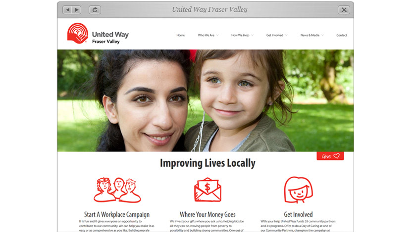
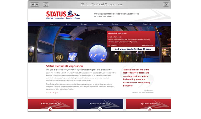
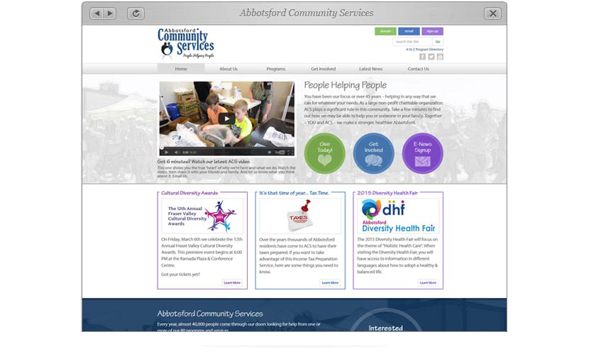
Go Ahead... "Click" The Tires
Here are a couple of our recent mobile friendly websites. View them on a mobile phone or tablet to see the responsive design in action.
We are so proud of our new site and could not have achieved our dream of having an interactive website without the tremendous support of Triple I Web Solutions.

Latest News & Articles

Portfolio of Work